Data Visualisation Used in my Research
I've been doing astrophysics research for several years; that's a lot of time to make some cool plots of our Universe.
Colliding Wind Binaries
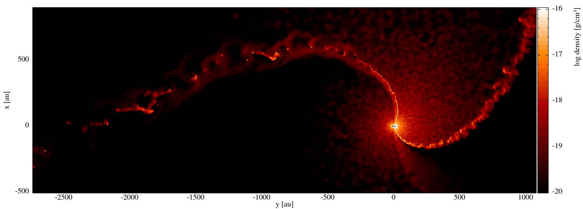
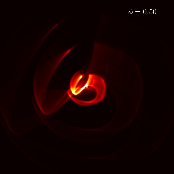
Most of my research so far has focused on the powerful colliding wind binaries. In these systems, the winds of two closely orbiting massive stars collide. The wind of one star overpowers the other, forming a bow shock which condenses the wind and proceeds to copiously form carbon dust. The image above shows a snapshot of a hydrodynamic simulation of exactly this. The coloured regions show the gas density in a 2D slice around the binary stars at the centre. You can see regions of high density even quite far out, and this shows us that dust can live in dense clumps for a long while after formation.
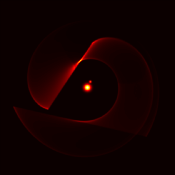
If we plot the same simulation as above, but look at the projected density of the dust from 3D space to 2D space (rather than a 2D slice), we see this:
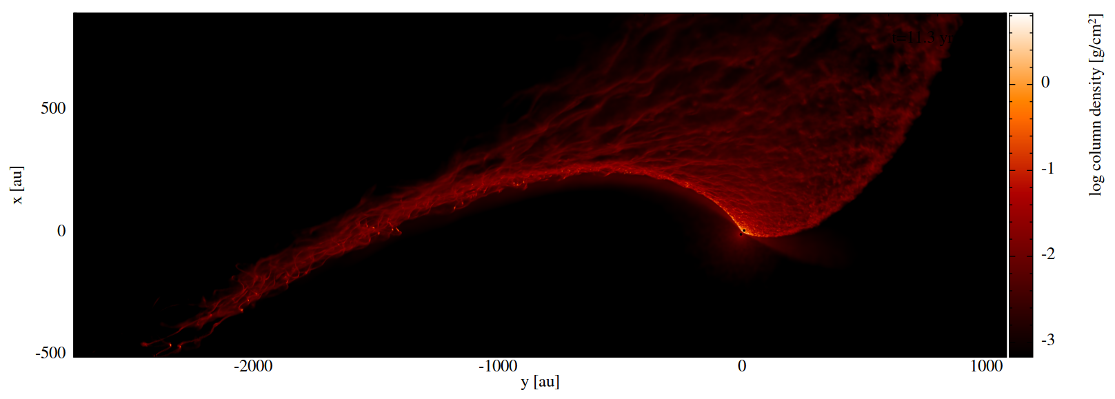
You can immediately see that the dust formed is extremely 'fluffy' which matches closely real images that powerful telescopes have taken of these systems.
In a 3D hydrodynamics simulation with similar parameters, we produced an animation of the orbital evolution of the stars (this time a 2D density slice). This shows us how the conditions of dust formation change across the orbit.
Supernova Time Dilation
My first academic paper was all about a unique way we can measure the expansion of the Universe: time dilation! I go into much more detail on this page, but in essence we use the light curves (brightness vs time) of ~1500 supernovae across cosmic distance to measure how they get slower the further you get away (exactly as expected by special relativity).
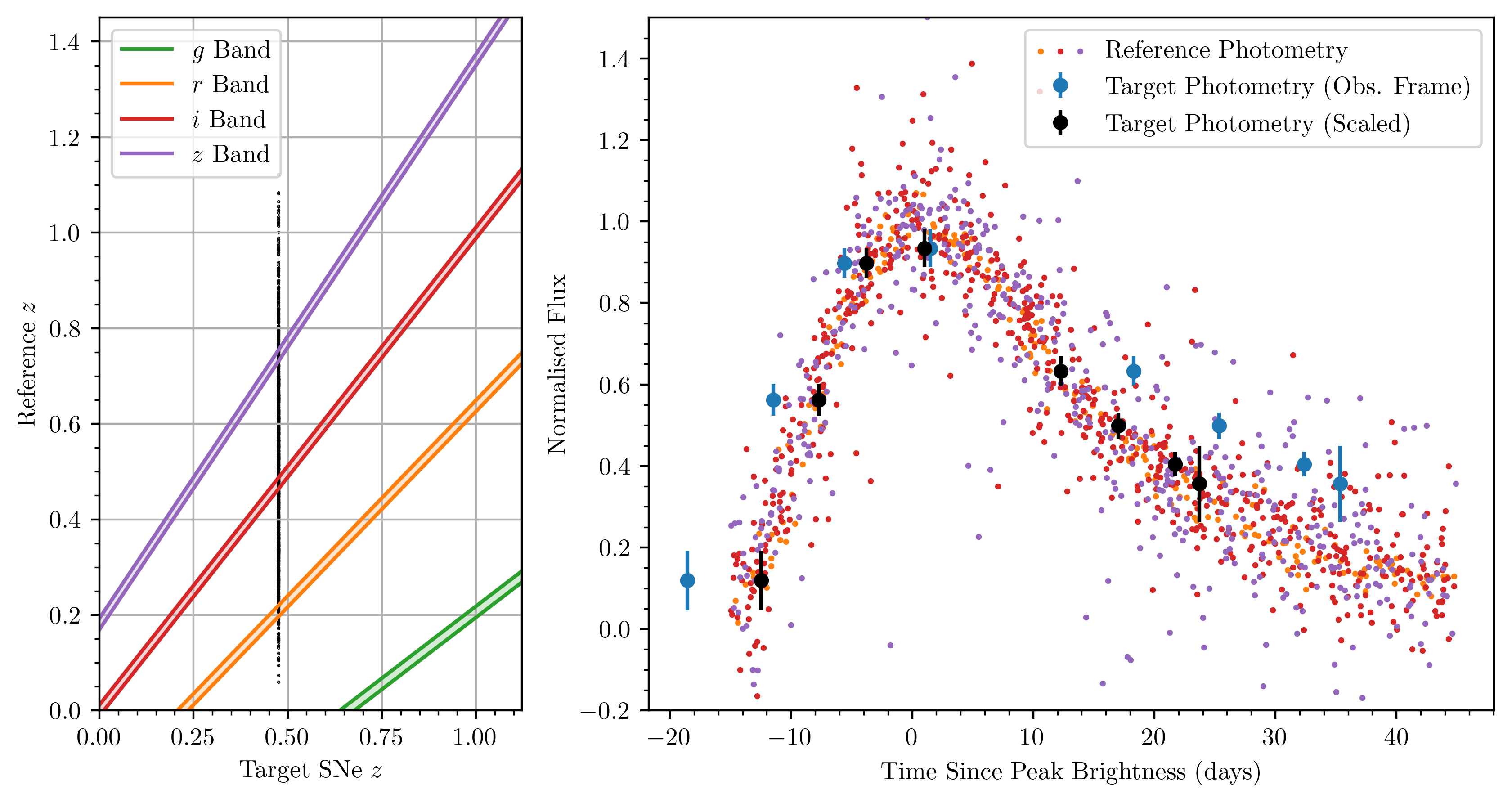
The above plot shows the gist of our method. The tl;dr is that we use a select few of the 1499 supernovae to then compare to the other one to see how much wider it is compared to what we expect. The left panel shows how we select special supernovae out of the 1499: each black dot in the vertical line is a supernova, and wherever those dots cross a coloured band, we can use the supernova observed in that colour to compare to our special one supernova. The supernovae which cross these bands make up the 'reference photometry' in the right panel. The 'target photometry' is the data of our special one supernova, and you can see by its raw blue data that it's wider than the reference photometry curve. Our model then scales it down in time (black points) to best match the reference, and how much we scale it tells us how time dilated it is. We go on to do that for all 1500 supernovae individually, and voila! that's our measurement of the expansion of the Universe.
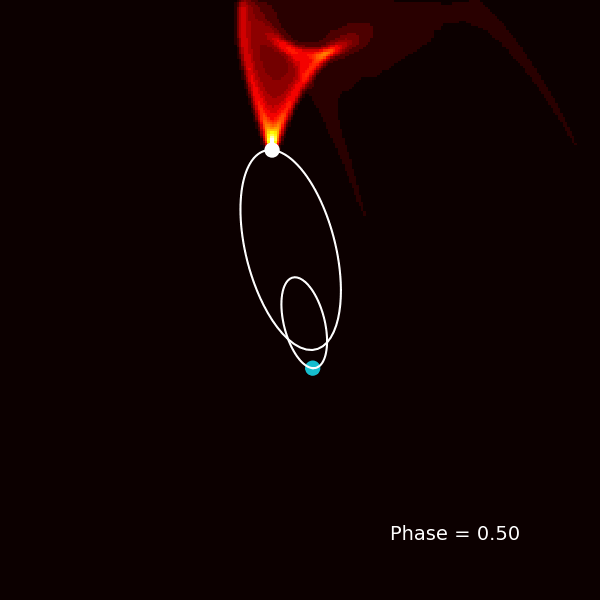
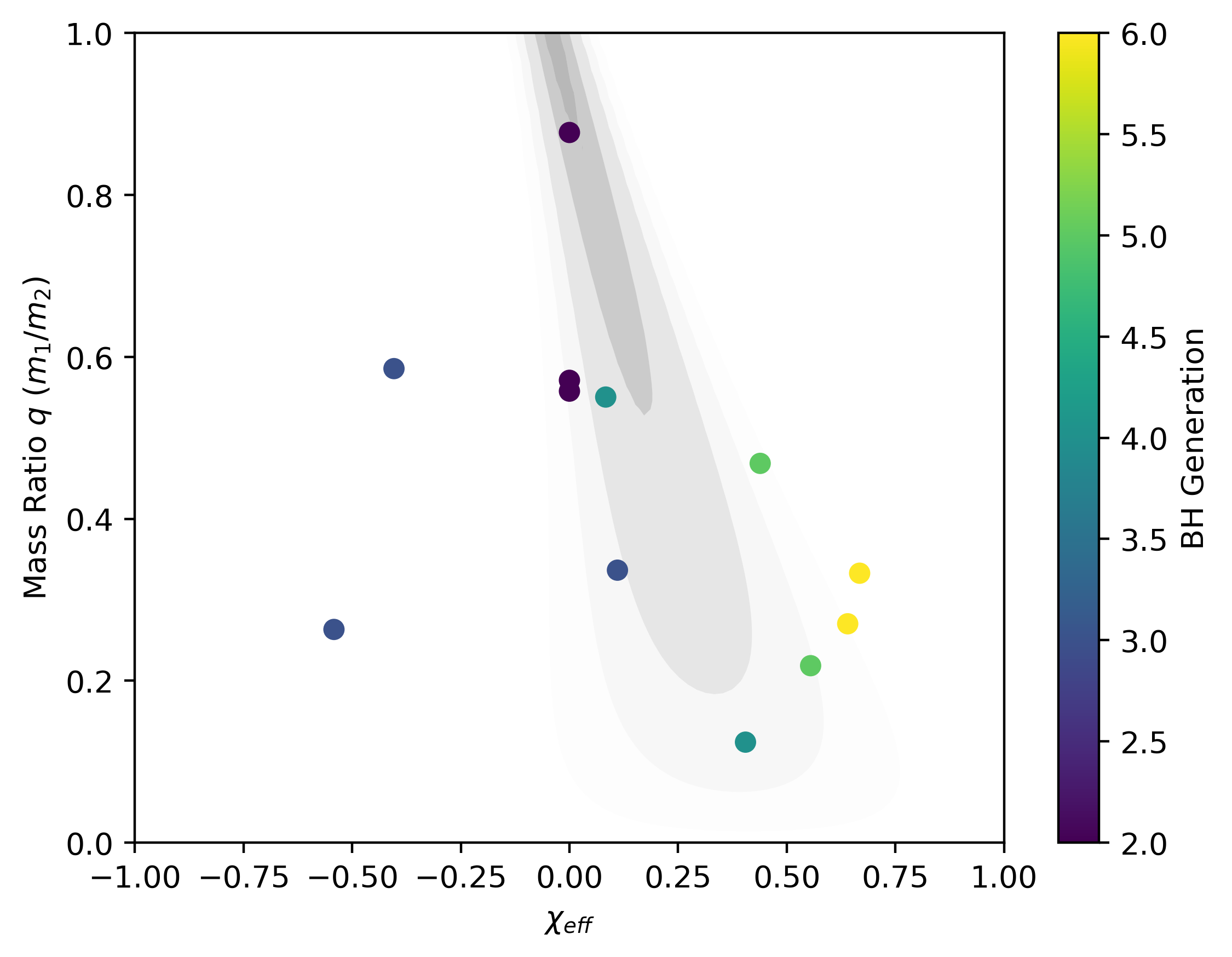
Merging Binary Black Holes Around Supermassive Black Holes
A particularly fun research project I did — at Swinburne University with Dr Simon Stevenson — was all about simulating how stellar mass black holes merge when swirling around a much larger supermassive black hole (SMBH). For this project, I developed a significant extension to the open-source code Rebound to model numerical relativity during an N-body simulation of many black holes. You can see some of our preliminary results below.
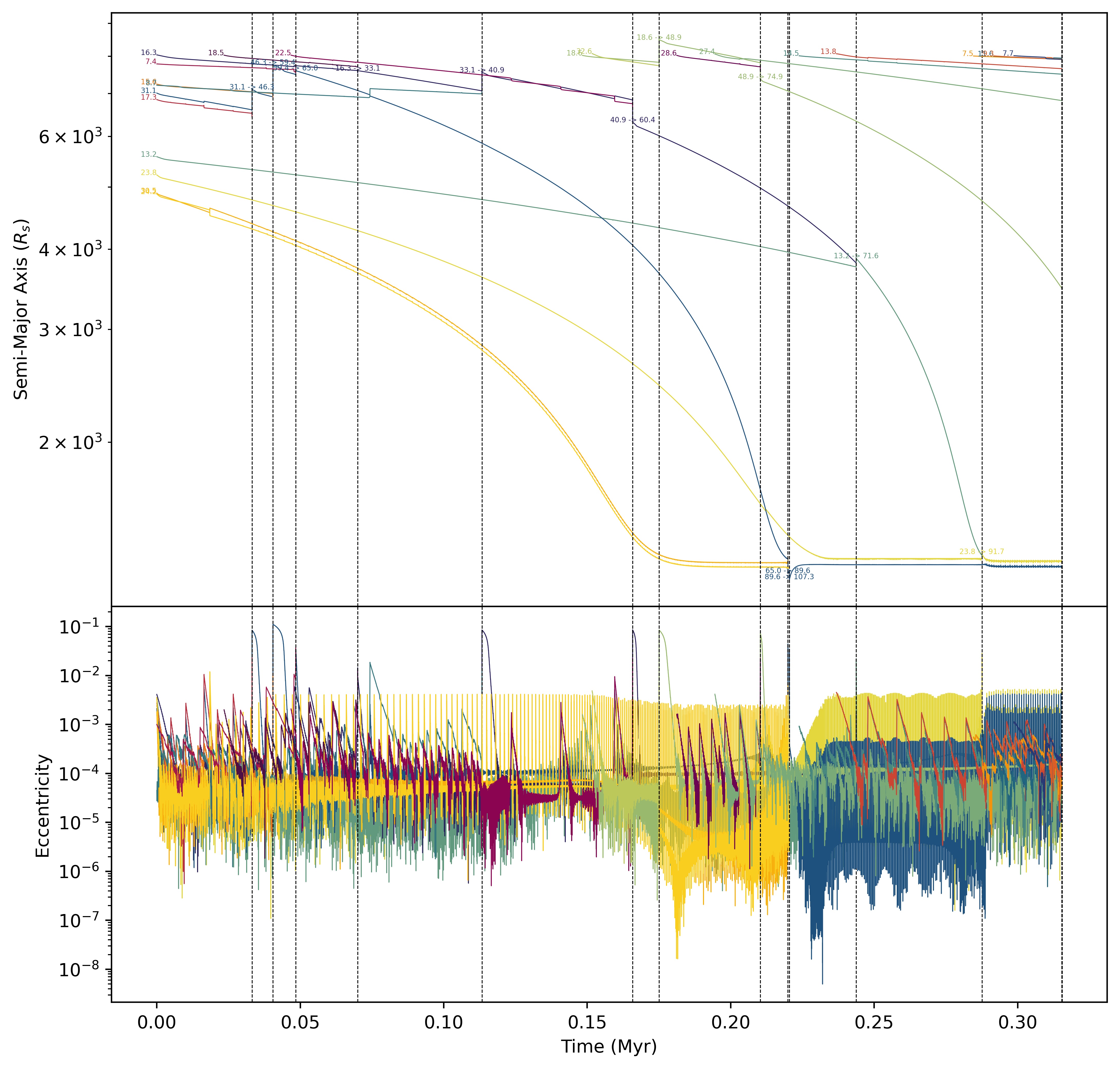
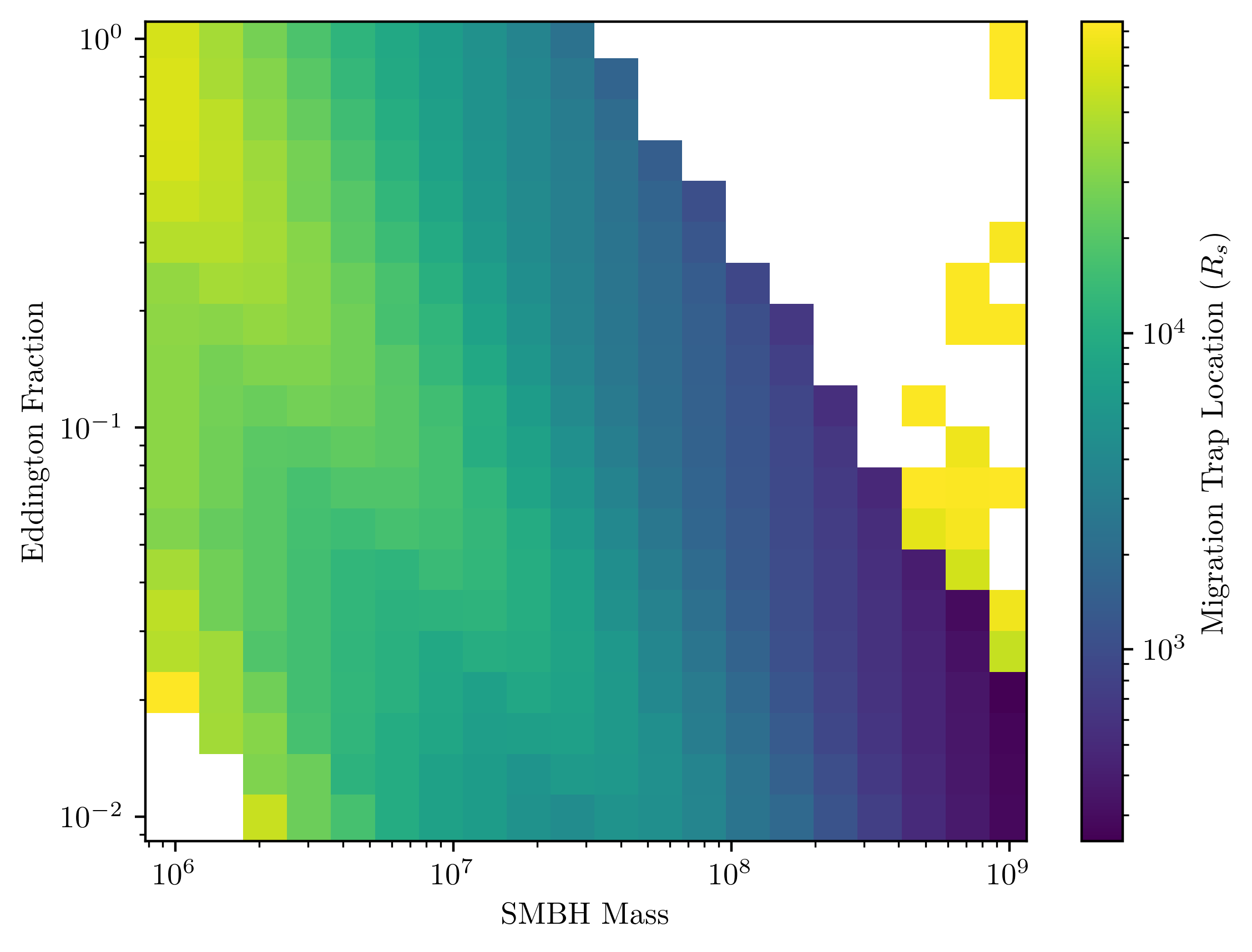
This plot shows the results of one of our simulations. Each line here represents a single black hole, where all of these are orbiting in a gaseous disk around a SMBH. The top panel shows that small BHs start far out and migrate inwards in the disk, towards a 'migration trap' (see figure in the right sidebar of the page for more info). As many black holes swirl inwards, they interact and some merge (represented by a dashed vertical line, where the numbers show the initial and final mass of the merged BH). The bottom panel shows the orbital eccentricity of each BH — overall, very circular! After each merger or interaction there is a perturbation to orbital eccentricities, though. Overall, we found that this is a very efficient channel to merge BHs!
Long-Period Radio Transient Detection
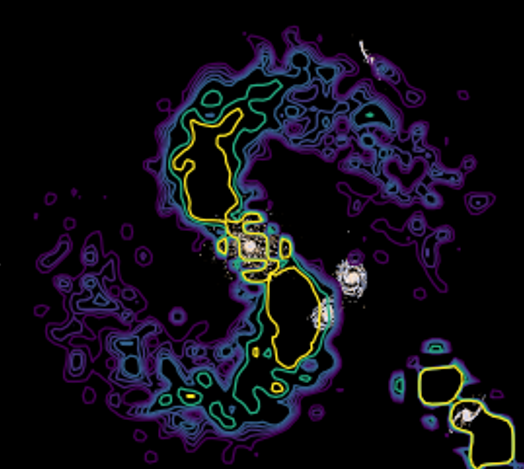
I was very lucky to begin the development of a transient-searching pipeline with Dr Andrew Zic at CSIRO. More and more, astronomers are finding radio transients with periods of minutes or more, and we need a systematic way to search for these. Our idea was to use interferometric visibilities of the telescope arrays directly, rather than going through an imaging step first — this saves orders of magnitude of computational cost.
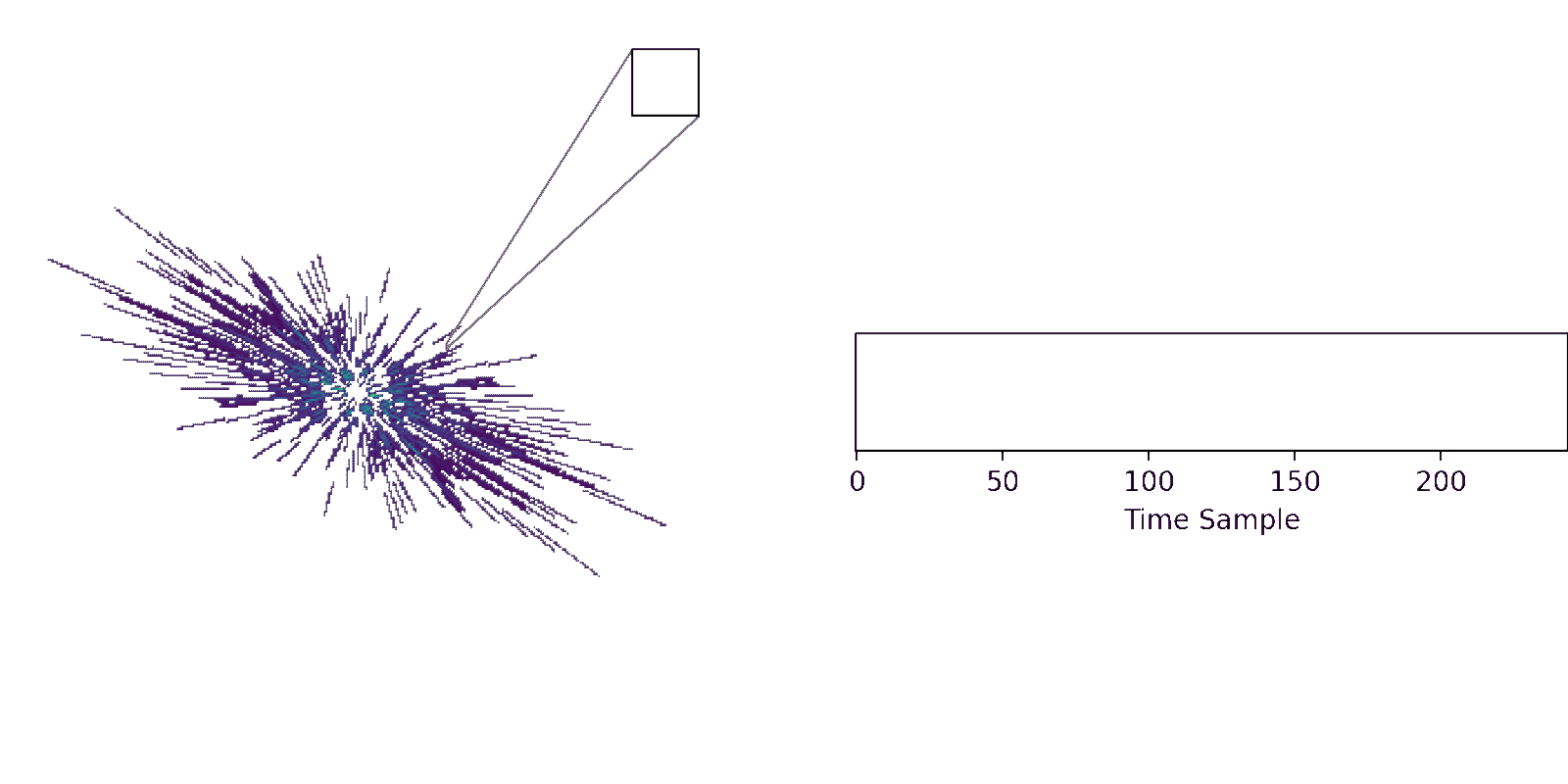
The above animation shows one step of our pipeline. The left pattern is a u-v diagram, which rotates as the telescope is observing the sky for hours. Our method involves looking at all of the u-v pixels that are ever occupied, then using the time series data of each of those pixels to search for periodic jumps in brightness of stars.