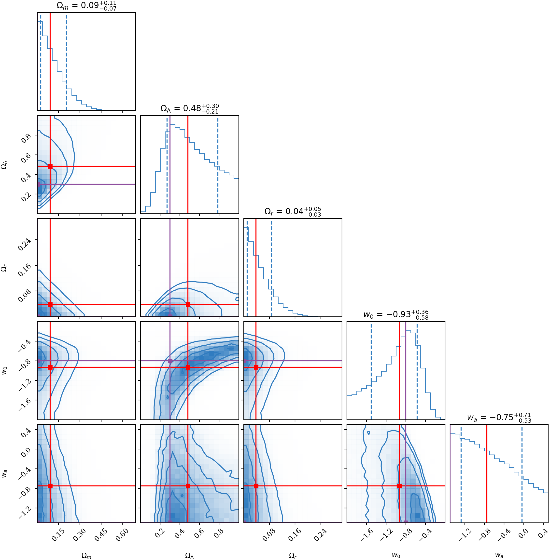
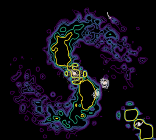
Data Visualisations
How we represent data is just as important as the data itself

Over my years of study and research, I've developed a significant body of visualisations of all types of data. There are many factors to consider when making these plots or animations, e.g. how do we best convey underlying relationships in the data? What is the key takeaway needed for the reader? And especially important, how do we make it pretty?
Across the three pages below, you can see some of my favourite plots that I've made in my years of data analysis and science research.