Data Visualisation From My Studies
I did a double degree in Science and Mathematics, majoring in Physics and Applied Mathematics. As part of that, you make a fair few plots!
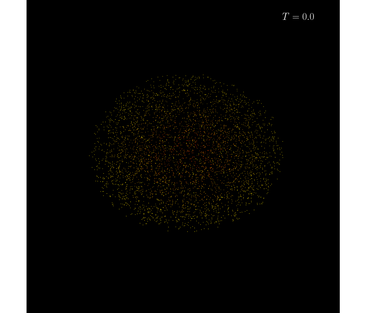
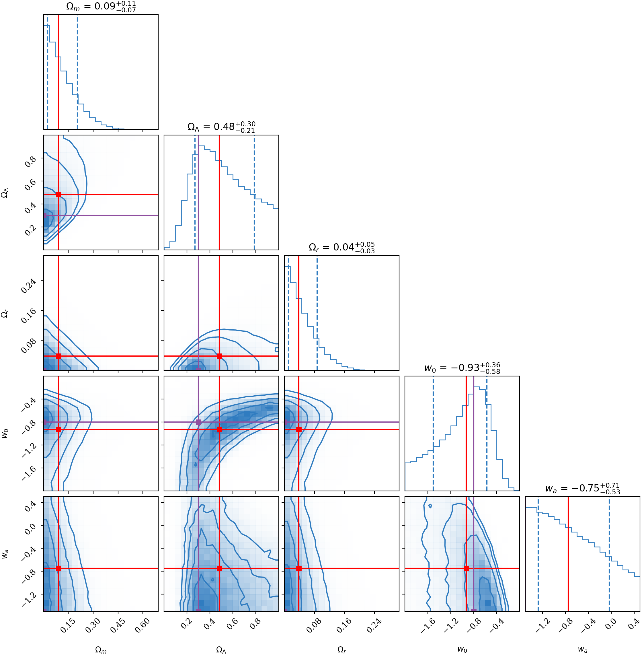
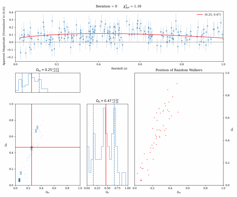
One of the most versatile tools in an astronomer's toolbox is Markov Chain Monte Carlo. This is a way to infer the optimal parameters given a model to fit to some data, while simultaneously recovering your uncertainties in your parameter values. How this works is you have a series of 'walkers' which move around your parameter space and evaluate your model fit to the data given those parameters (below animation, bottom right panel). The walkers tend to move into regions of higher parameter likelihood, and so your 'spatial' density of parameter evaluations gives a posterior distribution for your parameter values (below animation, bottom left panels). Given enough steps, your mean or median posterior values gives you the best fit to your data (below animation, top panel).
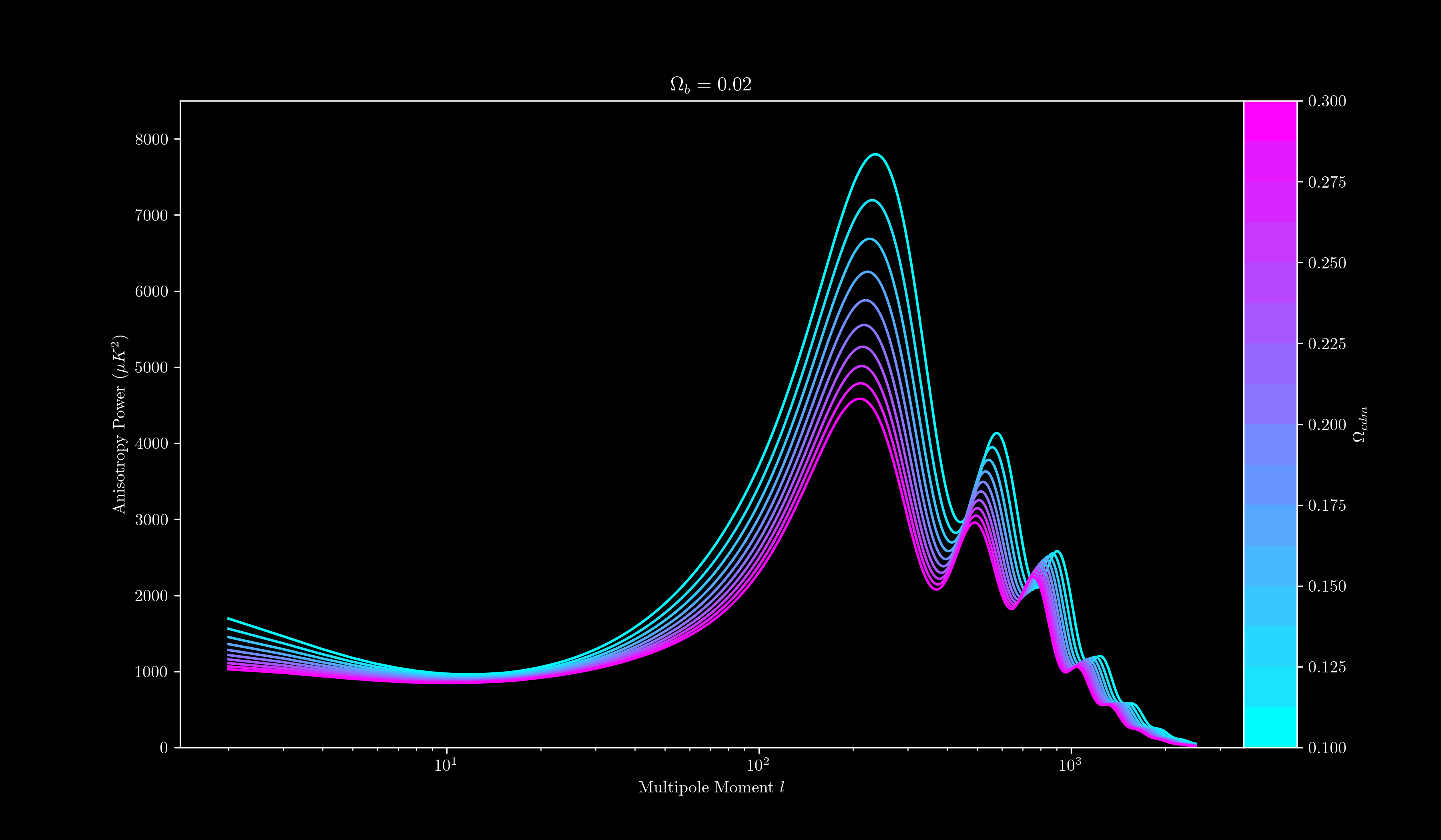
I must have an affinity for animations, because my next visualisation to share shows how the power spectrum of the Cosmic Microwave Background is sensitive to the baryonic and cold dark matter content of the Universe. Each line shows the strength of features in the Cosmic Microwave Background in relation to their length scale on the sky. For all of our tested parameters, there's always a prominent bump around the 100 multipole moment — characteristic of the Baryon Acoustic Oscillations — but changing the parameters sensitively changes the bumps on smaller angular scales (which is how we can precisely determine these parameters when comparing to observations!).
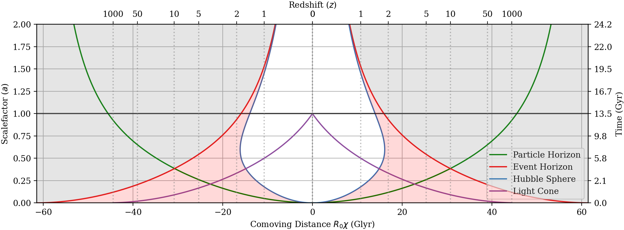
While still on the topic of cosmology, the below plot shows a spacetime diagram of our Universe. This shows the causal relationship of events across space (x-axis) and time (y-axis), given the expansion of the Universe as dictated by the cosmological parameters. The particle horizon (green line) shows the maximum distance that light can travel from our position since the beginning of the Universe; the red line (the event horizon) shows the region of space in which light could *ever* interact with us at our spatial position; the purple line (the light cone) shows the region of spacetime that is potentially interacting with us right now; and the Hubble sphere shows the region of space that is expanding away from us at the speed of light.
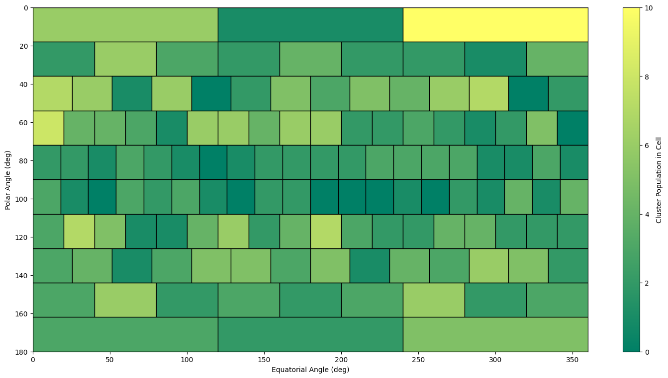
The below plot is one that I am particularly fond of, and made custom for myself (there's no standard way to make this in matplotlib!). The domain of the plot is the entire sky — since we're projecting a sphere onto a rectangle, there is significant warping near the poles (top and bottom of the rectangle). Each rectangle in this plot subtends and equal angular area in the sky, so by counting the number of galaxy clusters in each cell this way we're intrinsically accounting for projection effects. The result is a more-or-less isotropic distribution of galaxy clusters (in simulated data) — exactly as we'd expect in our Universe!